Usage
With the Analytics Dashboard you can create a report to measure KPI and display statistics and charts for all account calls, ten-digit phone numbers, users, or groups.
Access the page from the side navigation menu under Admin Center Menu>Analytics. Access is available to Account Owners, or users who have a role with Analytics view permissions (roles are explained here).
The Analytics Dashboard integrates and shares parameters with Saved Reports. Analytics is used for charts and KPI statistics, while Saved Reports provides more extensive numerical data.
A simplified summary of call activity can also be viewed on the Admin Center's home screen or the Live Wallboard.

Report Saved Views
A report view is the data that the system displays based on the report type, KPIs, filters, and the date range you selected. Click the Saved Views (  ) button to manage report views (the button appears as
  when a view is actively selected).
Select a saved view (marked with  ) to switch to it. Note the report type is indicated next to the name of the view.
When a view is selected and you change any of its paramaters (columns, filters, date range), you can save these to either the current view or as a new view. If you don't select a view (or click Clear current selection), you can only save changes as a new view.
The Manage saved reports option will take you to the Saved Reports page.

Sharing and Exporting Reports
Use the buttons on the top-right bar to share and export the report data.
- Export CSV: Select
 to export a CSV file of the report to your device.
- Share report: Select
 to share a web link of the report. The available sharing options depend on your device and browser. To view the report, the recipient of the link needs to have Admin Center credentials and a role that allows access to Analytics.
 - Show Call History: Select Show Call History to switch to and share your selected parameters to the Call History Report page.
Date Range
Use this drop-down menu to select a date range for which to include report call activity.
The predefined choices start from Today and go all the way back to Last Year or you can use the Enter a custom date range field to select a date range of your choice. Click the date field to enter the date manually with your keyboard.

Report Type
The five different report types determine the measured data and how it is displayed on the x-axis of the report chart. The Group and User reports have different view choices for changing the x-axis parameters.
Data on the Account Calls report and the Time view of the User and Group reports can be grouped, while all other reports only have a sorting option. Grouping is explained here . Sorting is explained here.
- Account Calls: Measures the number and duration of all phone calls, with the x-axis showing measured call KPIs in relation to date-time units. The date-time units are controlled by the Group by, Interval, and Sum options.

- Phone Numbers: Measures the numbers and durations of calls placed or received on your ten-digit phone numbers, with the x-axis showing call KPIs for each phone number.

- User Calls: Measures the numbers and durations of calls that involved phone system users. For example, if a caller hung up a call while navigating an IVR or waiting in a call queue, this call does not count in this report since the caller never reached a user.
The Users Calls report has two views –
For the Users view, the x-axis shows measured call KPIs for each user.
For the Time view, the x-axis shows measured call KPIs in relation to date-time units that are controlled by the Group by, Interval, and Sum options. While this looks similar to the Account chart, keep in mind that only calls that actively involved users are included.
- Group Calls: The report measures the numbers and durations of calls routed to hunt groups and call queues.
The Group Calls report has three different views –
For the Groups view, the x-axis shows measured call KPIs for each group.
For the Agents view, the x-axis shows measured call KPIs for agents who belong to these hunt groups and call queues. AI metric KPIs are not applicable to because they measure averages per agent.
For the Time view, the x-axis shows measured call KPIs in relation to date-time units that are controlled by the Group by, Interval, and Sum options. While this looks similar to the Account chart, keep in mind that only calls that were routed to hunt groups or call queues are included.
- Call Intelligence: This report is only available if AI Call Intelligence is enabled on your account. Subscribe to this service from the Account Settings page.
The report measures the numbers and durations of calls in relation to AI call metrics and has four different views –
For the Call Purpose view, each x-axis column measures call KPIs in relation to a call purpose category.
For the Call Sentiment view, calls are grouped on three x-axis columns, measuring call KPIs in relation with Neutral, Positive, and Negative sentiments.
For the Customer Satisfaction and Agent Performance views, the x-axis measure call KPIs as 1-10 grading for customer satisfaction or agen performance.
Configure KPIs
Key Performance Indicators is a term describing measurable performance for a company or a system. These are basically various values of the call, users, and group activity shown for the date range you selected.
KPI measurements depend on the type of report selected. For the Phone Calls report, the All Calls KPI indeed counts all the calls dialed and received by all users on all lines and phone numbers. But for the Phone Numbers report, it only counts all the calls on ten-digit numbers, and for Group Call it only counts all the calls routed to queues or hunt groups.
Check or uncheck the KPIs you want to show or hide in the report. You can also drag KPIs up or down to arrange them according to your preferences. If you select RESET, all KPIs will be enabled and get arranged in their default order.
When selecting KPIs, you can use the Select All keyboard shortcut – Control+A on Windows and Linux or Command+A for Macs.

Active KPIs are shown in two ways:
- All the KPIs that you checked are shown as KPI buttons according to the way you arranged them. The KPI buttons summarize activity for the entire date range.
Click to mark the KPIs you want to apply to the chart.
- KPIs on the chart show activity for each date/time interval unit (hour, day, week, day of the month, etc).
Not all the selected KPIs are shown, but only the KPIs buttons that you marked.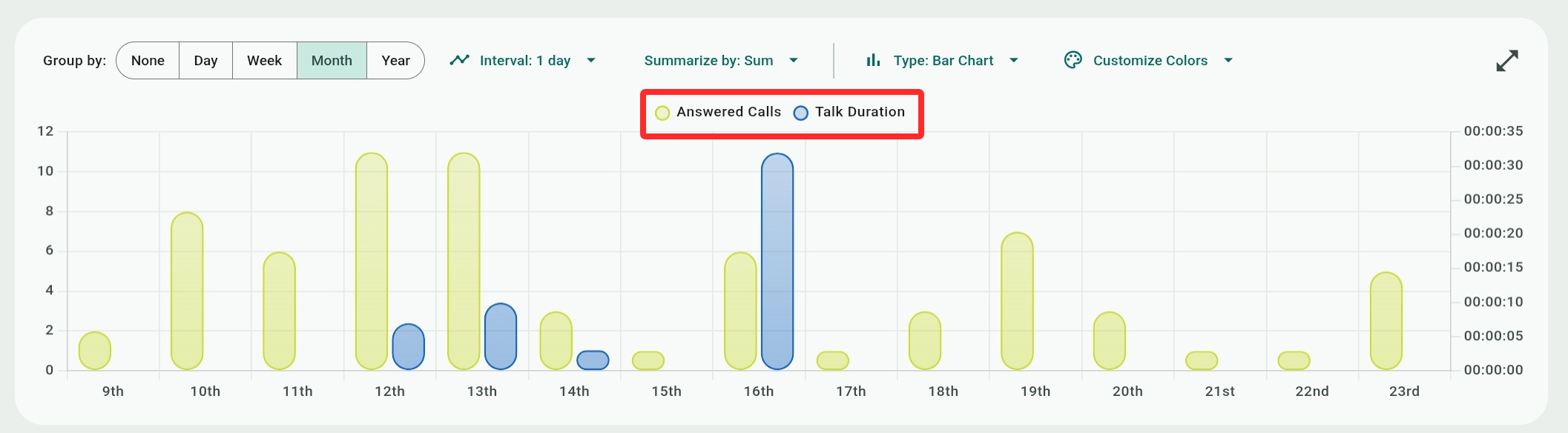
Custom KPIs
You can create your own custom KPIs by combining several filtering parameters for additional measurement of call scenarios not covered by the regular KPIs.
Note the distinction from AI custom KPIs for call transcripts that are defined in the Account settings page using AI prompts, as explained here.
Both kinds appear at the end of the KPIs/buttons list, and are tagged as "Custom" or "AI" respectively.


Click Manage KPIs to access the custom KPIs dialog. Existing custom APIs will be shown here and can be copied (duplicated) or deleted.
Use  to create a new custom KPI. Once created, a custom KPI appears in the Configure KPI list for all the reports checked in the Report Types field. It will also be available for the same report types in Analytics.

- Name/Description: Self-explanatory. Description is optional.
- Report Type: Select which report type the custom KPI will be available for use with – Account, Phone Numbers, or Users (Groups and Call Intelligence reports are not applicable).
If you want to use the same custom KPI for a different type of report, you need to create the report, copy it, and change the report type. - Select KPI Color: This is only applicable to Analytics and not to Saved Reports. Select the color of the KPI for its KPI button and appearance on the Report Chart.
- Statuses: Select call statuses that apply to the KPI – Answered calls, Missed calls, or calls that were routed to Voicemail.
- Direction: Select the call directions that applies to the KPI – Outgoing External (a call dialed by a user to an external recipient), Incoming External (a call received by a user from an external caller), Incoming Internal (a call recieved by a user from another user), and Outgoing Internal (a call dialed by a user to another recipient).
For the User report type, there are other choices – Incoming External (calls received by users from external destinations), Outgoing External (calls dialed by users to external destinations), Incoming Internal (calls received by users from other users on the phone system), and Outgoing Internal (calls dialed by users to other users on the phone system). - Call Duration (only available in the Users report): Use the Start and End drop-down lists to filter call duration for the KPI (the time from the moment a call was answered until it ended). The No Limit default option will include calls of any duration.
- Ring Duration (only available in the Users report): Use the Start and End drop-down lists to filter ring duration for the KPI (the time before a call was answered by any user or was routed to voicemail). The No Limit default option will include calls of any duration.
- Add tags: Select call tags that apply to the KPI – Abandoned, Transferred, Repeated, Called Back, Group Calls. Tags are described below in the Data Filters section.
When you add a tag, you can click it to make the KPI exclude its data from the report. Click the tag again to include its data in the report.
Available KPIs
Some KPIs do not apply to all reports or report views. For example, the Phone Numbers report does not include the Internal Calls KPI because the report measures calls on ten-digit phone numbers, and therefore internal lines are irrelevant.
The Group Calls report has a different set of KPIs compared to the other reports, which share many KPIs. The User Calls report has some additional KPIs to better detail answered and missed calls based on call direction.
AI metric KPIs are automatically generated data based on AI analysis of call transcripts, and are only available if enabled on your account. AI insights and AI-generated transcripts can be viewed on the Call History report page by opening call details. AI metric KPIs do not apply to the Phone Numbers report.
Account Calls, Phone Numbers, User Calls, and Call Intelligence KPIs
- All Calls: The number of missed, answered, and abandoned calls. Internal calls between users are only counted as one call, even though technically they involve both an outgoing call for one user and an incoming call for the other.
- Voicemail (not applicable to User Calls): The total number of calls that were not answered and reached a user (or a department) voicemail.
- Talk Duration: The talking time between callers and users, measured from the moment a call is answered.
- Missed calls: All unanswered calls, excluding voicemail calls, such as calls that were declined by the recipient, calls that were abandoned, calls to lines that have no voicemail configured, or calls that were routed to destinations that ended the call (busy tone, logged out users, etc.)
Note that in a scenario such as a hunt group, a call that rings multiple agents simultaneously is also counted as a missed call for those agents once answered by one of them, even though technically the other agents did not decline or ignore it. You can identify such missed calls using the "Simultaneous Calls" filter. - Answered Calls: All calls that were answered by users/agents.
- Missed Calls by User / Answered Calls by User (only applicable to Account Calls, User Calls, and Call Intelligence): These KPIs count inbound calls answered or missed by users (excluding outgoing calls), providing clearer insights into individual user performance.
- Call Duration: The sum of combined durations for calls' holding and talking time.
- Incoming Calls/Outgoing Calls: Outgoing calls are calls placed by users. Incoming calls are calls arriving from external callers or other users.
- Abandoned Calls (not applicable to User Calls): Calls hung up by callers while waiting on hold.
- Repeated Calls: Calls that originated from the same number on the same day.
- Internal Calls (not applicable to Phone Numbers): Internal calls between users are considered outgoing calls on the caller's side and incoming calls on the recipient's side, but they are just counted as one incoming call.
- Group Calls: Calls that were routed to a call queue or a hunt group (usually from an IVR).
Additional User Calls KPIs
- Outgoing External Calls: Counts calls placed by users to external customers or destinations outside the company's phone system.
- Outgoing Internal Calls: Counts calls placed by users to other users or destinations on the company's phone system.
- Incoming External Calls: Counts calls received by users from external customers or destinations outside the company's phone system.
- Incoming Internal Calls: Counts calls received by users from other users or destinations on the company's phone system.
Missed External Calls: Counts calls from external customers or destinations outside the company's phone system that users did not answer.
- Missed Internal Calls: Counts calls from other users or destinations on the company's phone system that users did not answer.
Group Calls KPIs
Note that the Total Agents, Callback Requests, and AI metrics KPI are not applicable to the Agents View.
All calls, Talk Duration, Answered Calls, and Abandoned calls are the same as the other reports. What is counted are calls in queues and hunt groups – for example. All Calls counts all the calls in a group and not all calls in general.
- Wait Time Duration: The sum of time callers spent holding in the queue or hunt group before their calls were answered.
- Average Talk Duration: The average time agents were talking to callers in the group, calculated by taking the Talk Duration and dividing it by the number of answered calls for the group.
- Average Wait Duration: The average time callers spent holding in the queue or hunt group, calculated by taking the Wait Time Duration and dividing it by the number of All Calls for the group.
- Exit Calls: Calls routed out of a group. Exiting a group can happen after the system tried to ring all group agents, for certain thresholds (like too many holding calls), or when the caller dials *.
- Total Agents (not applicable to the Agents view): Distinct count of agents whose line rang for at least one call in this group during the period.
- Login Time (Only Agents view): Total time the agent were logged in (available to receive calls) in their queues or hunt groups during the period.
- Ring No Answer: The number of agents the system rang in the group who didn't answer. For example, if a call rang and was answered after ringing four agents, then this KPI counts it as having been ignored by three agents.
- Callback Requests (not applicable to the Agents view): Calls where the caller dialed a prompt key to request that an agent call them at their number instead of holding in a queue or a hunt group.
Additional AI metrics KPIs
If AI Call Intelligence is enabled for the account, these KPIs will be available to all types of reports except for the Phone Numbers report.
- Average Customer Satisfaction: Customer satisfaction is a score between 1 and 10, determined by the AI for how a customer feels about the handling of their call and issues raised. The KPI calculates the average by summing all satisfaction values and dividing it by the number of calls.
- Average Agent Performance: Average Agent Performance is a score between 1 and 10, determined by the AI for how an agent handled the customer call and issues raised. The KPI calculates the average by summing all performance values and divding it by the number of calls.
- Negative Sentiment Calls/Neutral Sentiment Calls/Positive Sentiment Calls: Call sentiment is the general tone of conversation between the customer and the agent. These KPIs count the number of calls with negative, neutral, or positive sentiment.
Average agent performance score derived from AI analysis of call transcripts. Only calls with a transcript and completed AI analysis are included.
Filters
You can use one or more filters to narrow down or refine the report's results. The Phone Calls, Phone Numbers, and Users report have the same filters, with the exception of different Direction filters for the Users report.
The Groups Calls report has some additional filters and different choices for the Statuses filter. Some Tag filters are only applicable to some reports.
AI metric KPIs filters are only available if enabled on your account. AI insights and AI-generated transcripts can be viewed on the Call History report page by opening call details.
When checking or unchecking filter choices, you can click Apply or just click anywhere on the screen to apply your choices. Select Clear or  to remove a filter's selections or remove all filters with Clear all.

Account Calls, Phone Numbers, User Calls, and Call Intelligence Filters
- Phone Numbers/Users/Extensions: Check the choices that you want to see report results for. Phone numbers are ten-digit numbers for external calling, while extensions apply to user lines.
- Groups: Both queues and hunt groups can be selected here.
- Direction: Select to show Incoming calls from outside destinations, Outgoing calls to external destinations, or Internal calls to other users on the phone system.
For the User Calls report, there are other choices – Incoming External (calls received by users from external destinations), Outgoing External (calls dialed by users to external destinations), Incoming Internal (calls received by users from other users on the phone system), and Outgoing Internal (calls dialed by users to other users on the phone system). - Status: Select to show calls that were Missed, Answered, or were delivered to the user as a Voicemail.
- Time of day: Use the two sliders to select an hour range, with 15-minute intervals, to show report results for. Any calls outside this time range will be excluded from the report.

- Duration: Use the two sliders to select a call duration, with five-second intervals, to show report results for. Any call longer than this duration will be excluded from the report.

- Tags: Check tags to include them in the filtering, or select X to exclude them. In the example figure, we have selected to show group calls that were transferred, and from the resulting list we exclude repeated calls.
 Transferred: Calls that were transferred by users or the call center administrator (using the Active Calls Switchboard or ACD Dashboard).
- Abandoned: Calls hung up by the caller while waiting in a queue, during an IVR greeting, etc.
Excluding the tag will show calls that were answered by an agent before the caller decided to hang up. - Repeated: Calls that were repeatedly dialed from the same number on the same day.
- Recorded: Calls that were recorded can be accessed and played in the call details tabs (see next).
- Called back: Calls where a user or an agent responded to a call they missed or that was routed to their voicemail.
- Group call: Calls routed to agents from groups (hunt groups or queues). Excluding this will show calls that were routed directly to an agent.
- Contain Transcript: Automatic transcriptions are available on the Admin Center for voicemails (accessed from the Mailboxes screen ) and for phone calls. This tag refers to phone call transcriptions that can be viewed in the call details (see next).
- On Call (only applicable to User Calls): The "On Call" tag counts users who were already on another call when making or receiving a call. Excluding the tag will count users who were not busy with another call when making or receiving a call.
- Simultaneous Calls (only applicable to User Calls): The "Simultaneous Calls" tag shows all the users the system simultaneously rang but did not answer because someone else answered the call or the caller hung up.
The tag helps you differentiate between calls users actually missed (by declining or ignoring them) and calls that were not technically missed by users because another user picked up the call or the caller hung up.
It is useful to combine the tag with the Answered or Missed Status filter to better understand how the involved users handled the call.Exclude the tag to see users who were directly involved in a call, as it didn't ring any other users simultaneously.
- Callback Request (only applicable to Group Calls): Calls where the caller requested to be called back by dialing *. The system notes the caller's number and provides it to agents. The caller can hang up and wait for an agent to become available to call them.
- Action Required/Urgent Action Required (only applicable if AI metrics are enabled for the account): Calls where the AI determined that additional action or urgent action is required for resolving or addressing the issue raised by the caller.
- Day of month/Day of week/Month of year: Use the
 button (additional filters) to access these three filters and further refine the results for the date range.
Group Calls Filters
- Groups, Phone Numbers, Time of Day, Day of month, Day of week, Month of year are the same as the other reports. The Tags filter is also mostly the same.
- Group Types: Select to show Hunt groups or Queues. Clearing the filter will also show both.
- Agents: Select which agent(s) to show results for.
- Statuses: Select to show calls that were Answered by an agent, Abandoned by the caller (caller hung up), or an Exit status when the call was routed out of the group. Exiting a group can happen after the system tried to ring all group agents, for certain thresholds (like too many holding calls), or when the caller dials *.
- Talk Duration: Use the two sliders or the Start/End drop-down menus to select a range for the duration agents talked with callers.
- Wait Duration: Use the two sliders or the Start/End drop-down menus to select a range for the duration callers waited for an agent to answer their call.
AI Metric Filters
These will only show if the AI call metrics feature is enabled for the account. AI insights and transcripts can be viewed with the Call Details on the Call History page.
- Call Purpose: The general intent of the call as determined by the AI. Unlike other filters, there aren't any pre-defined values to choose from. Instead, the choices are generated and added from call transcripts analyzed by the AI.
- Call Sentiment: The general tone of conversation between the caller and the agent – Negative, Neutral, or Positive.
- Customer Satisfaction: Use the two sliders or the Start/End menus to select a value from 1-10.

- Agent Performance: Use the two sliders or the Start/End menus to select a value from 1-10.
- Action Required/Urgent Action Required: These are included with the Tag filters, discussed above.
KPI Buttons
KPI buttons have four functions:
- They show the total sum of each KPI value for the date range you selected, for example the total number of answered calls for the past 30 days.
- They show a mini chart of the KPI's call activity.
- They act as toggles to place KPIs on the report chart. When you click a button, it is marked with
 and its KPI values are plotted on the report chart based on the grouping and interval selection.
 - Except for Account Calls, KPI buttons that you have toggled on are included in the "Sort by:" option.
Drag the KPI buttons row left or right, or use the on-screen arrow keys ( /
/ ) to scroll the row and show additional buttons. You can also click the
  /
/ icons to reduce or enlarge the size of the KPI buttons. The smaller button view hides the mini chart but will allow you to view all KPI buttons at once.
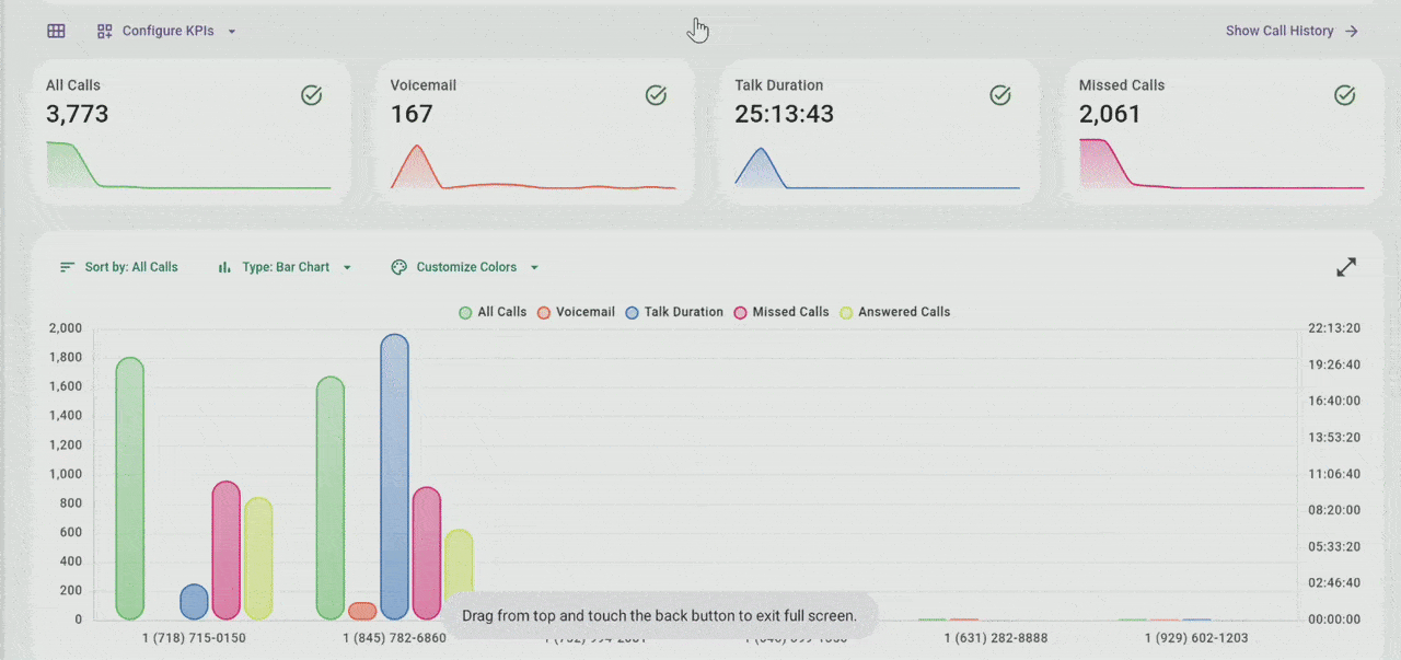
The Report Chart
A report chart is created based on all the above parameters for the KPIs buttons you checked.
X-Axis and Y-Axis Units
The left vertical (Y) axis measures the number of calls. The right vertical (Y) axis measures call durations.
The maxiumum value of the units on both the left and right y-axes depends on the checked KPI buttons. If no buttons relating to the number of calls are checked, the left y-axis will just show a range of 0-1. If no buttons relating to call durations are checked, the right y-axis will be blank.
The horizontal (X) axis units are different for each Report Type. For Account Calls, it shows time units based on your grouping selection or intervals. For the Phone Numbers report it shows external (ten-digit) phone numbers. For the Groups, Users, and Call Intelligence reports, the x-axis units depend on the selection of the View by: field.
Chart Types and View Controls
Use the Type: menu to display either a Bar Chart or a Line Chart. You can change the colors of bars or lines for each KPI on the chart from the Customize Colors menu.
Zoom in and out of the chart with the  buttons, by pinch zooming on touch-enabled displays, or with your mouse wheel. Switch the chart between full screen and regular size with
  /
/ .
.
Scroll the chart left or right with the on-screen arrow keys (/), by dragging it with your mouse, or by touch-scrolling it on touch displays.
Hovering over (or clicking and dragging) a bar or a line-chart point will display a bubble with the KPI values for its X position. Clicking a bar or a line-chart point will open the Account Calls History page to show all the calls related to this KPI value.
The chart has additional toggles to hide or show the active KPIs, useful in full-screen mode when the KPI buttons are not visible. To hide a KPI, just click it and it will be marked with a strikethrough font.

Adjusting the X-Axis (Date/Time) Values and Y-Axis Results
Group by and Interval are corelated chart menus for adjusting the X-axis date/time values. When changing these, you may need to zoom in to see the relevant details.
Summarize by is a menu that determines how grouped results are calculated and shown on the Y-axis.
Grouping options are only available for the Account Calls report and in the Time view of the Groups and User reports, as the time values of these (hours, days, months, etc.) are not unique. The other reports, in contrast, have unique values that cannot be grouped. For example, there is only one user called Louise Williams, so you cannot display a Louise Williams group.
For reports that cannot be grouped, a sorting option (see below) is available instead.
Group By
Values from your entire date range selection are summarized (grouped) for each point on the X-axis and relevant time points are shown. For example, selecting Week will display seven days/points on the X-axis for each grouped day of the week.
Grouping values allows you to analyze and compare periods of activity, like comparing the total number of incoming calls during weekdays to weekends to see if you need to move agents between the weekday and weekend shifts.
- None: Activity is not grouped on the X-axis and instead the units are determined by the Interval option!
- Day: Divides the X-axis into 24-hour time units (12AM-11PM). Activity is grouped for each round hour.
- Week: Divides the X-axis into 7-day date units (Sunday-Saturday). Activity is grouped for each day of the week.
- Month: Divides the X-axis into 31-day date units (1st-31th of the month). Activity is grouped for each date of the month.
- Year: Divides the X-axis into 12-month date units (January-December). Activity is grouped for each date of the month.
Interval
The Interval option determines what time units are used for dividing the report's date range or grouping. Each time unit corresponds to a point of the x-axis on the chart.
If the "Group by:" option is set to None, you have the freedom to select any time/date value, including a "1 year" interval (which will only really work if your date range covers several years).
Do consider that selecting the 1 Hour interval without grouping can create massive reports that may be hard to read or analyze. For example, for a date range of an entire year, you will get a 8760 x-axis points on the chart (for 24 hours times 365 days) and the amount of data may be an overkill.
For all other "Group by:" options, you can only select certain intervals. For example, if your grouping selection is "Week" you can select to divide the results into hours or days, but obviously weeks or months do not apply.
- 1 Hour: X-axis points represent round hours of caldendrical days – like 08/01/24 5 PM, or, if grouped, hours of a day based on the grouping – "10 AM" or "Sunday 10 AM", or "1st 10 AM", etc.
Calls include all calls for the round hour, that is 9 AM includes all the calls between 9 AM and 10 AM.
Depending on your date range, you may see intervals of 3 or 4 hours initially and may need to zoom in to see single hours. - 1 Day: X-axis points represent calendrical days of the month – like 08/01/2024, or, if grouped, days of the week – "Sunday", "Monday", etc.
- 1 Week (not applicable to any of the grouping options): X-axis points represent weeks of the year – like "2024 Week 20", "2024 Week 21", etc.
- 1 Month: X-axis points represent whole months of given years – like "June 2024", or, if grouped, just the grouped months – "June", "July", etc.
- 1 Quarter: X-axis points represent annual quarters – like "Q2 2024", or, if grouped, just the grouped quarters – like "Q2", "Q3", etc.
- 1 Year (not applicable to any of the grouping options): X-axis points represent whole years – "2024", "2023", etc. Usually, this will result in only one or two points, unless if you select a multiple-year date range.
Summarize By
This option lets you decide how grouped values are calculated and shown – as a sum of all data values or as an average.
To illustrate how this works, let's take a 30-day date range and group it by Week with a 1 Day interval. We have four Sundays in this date range with 8, 12, 17, and 3 calls, respectively.
- Sum: For each X-axis point, the total sum for each of the same days in the 30-day range is shown. In our example, this means the Sunday row will show a 40-calls sum.
- Average: For each point, the total sum for each of the same days in the 30-day range is first added and then divided by the number of the same days. In our example, this means the Sunday row will show a 10-call average.
Do keep in mind that averaging will only work if your date range includes enough divisible grouped items! Otherwise, the results for averaging will be just the same as the results for summing the data. If, for example, your date range is the "Last 7 Days" grouped as "Day of Week" with "1 Day" interval, you will only have one Sunday, one Monday, one Tuesday, etc. In this case, averaging the days divides their totals by one, giving you identical results to just summing them.
Sort By
The Sort by: option is available for the Phone Numbers, Users, and Group reports (except for the Time view).
The available choices are the same as the KPI buttons you checked to include in the chart (not the KPI you configured to be included in the report). In other words, even if your KPI buttons include all possible KPIs, sorting is available only for those that you applied to the chart.
When you sort a chart, its x-axis points will be arranged according to your selection in descending order from left to right.
In the following example, as illustrated by the red line, the chart is sorted by Missed Calls. Stephanie Stacey had the most missed calls and she is placed first (left most). She is followed by Beverly Mercado, who had the second most missed calls, then Erica Holdwort with the third most missed calls, etc
